

Building new muscles
Sharing three editorial illustration projects
In my 2025 recap post, I mentioned that I’d made a push to strengthen my editorial illustration skills in the second half of the year. Today I’m sharing the projects I worked on to do just that.
I knew it was the right path when an Inkygoodness challenge geared toward editorial illustration popped up on my radar last fall…and was terrible timing. I was prepping for a two week trip to Europe, in the midst of multiple design client projects, and knew that adding something like this course would be putting a lot of extra pressure on myself. And yet…I couldn’t not do it. Everything in my body was buzzing toward this course. The prospect of late nights and working on weekends didn’t seem daunting, but rather exhilarating – like how I felt back in college at art school, when creating felt exciting and not burdensome. I was so happy to feel that again. So I signed up, and am so glad I did.
The Editorial Playbook Challenge
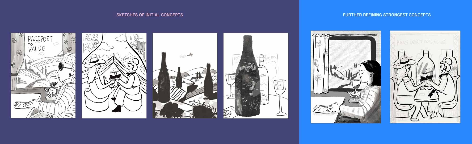
This challenge provided an opportunity to work on editorial briefs that mirrored what we could expect in the industry. There were five to choose from, and we could pick two to receive feedback on throughout the course. Even though they were speculative, the point was to treat our chosen briefs like real commissions, which meant adhering to things like color palettes, page size restraints, and strict deadlines.
The briefs I chose called to me because they were lifestyle-based and had to do with food and/or travel. We were to provide a sketch round, a round of color roughs, and then the final artwork, since that is what most Art Directors would typically expect from artists they commission.
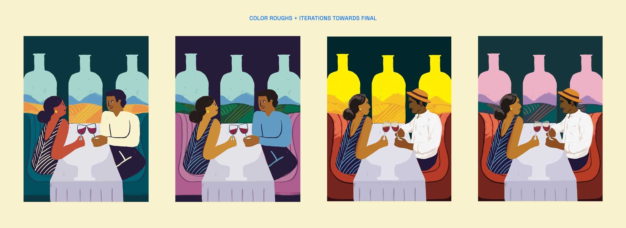
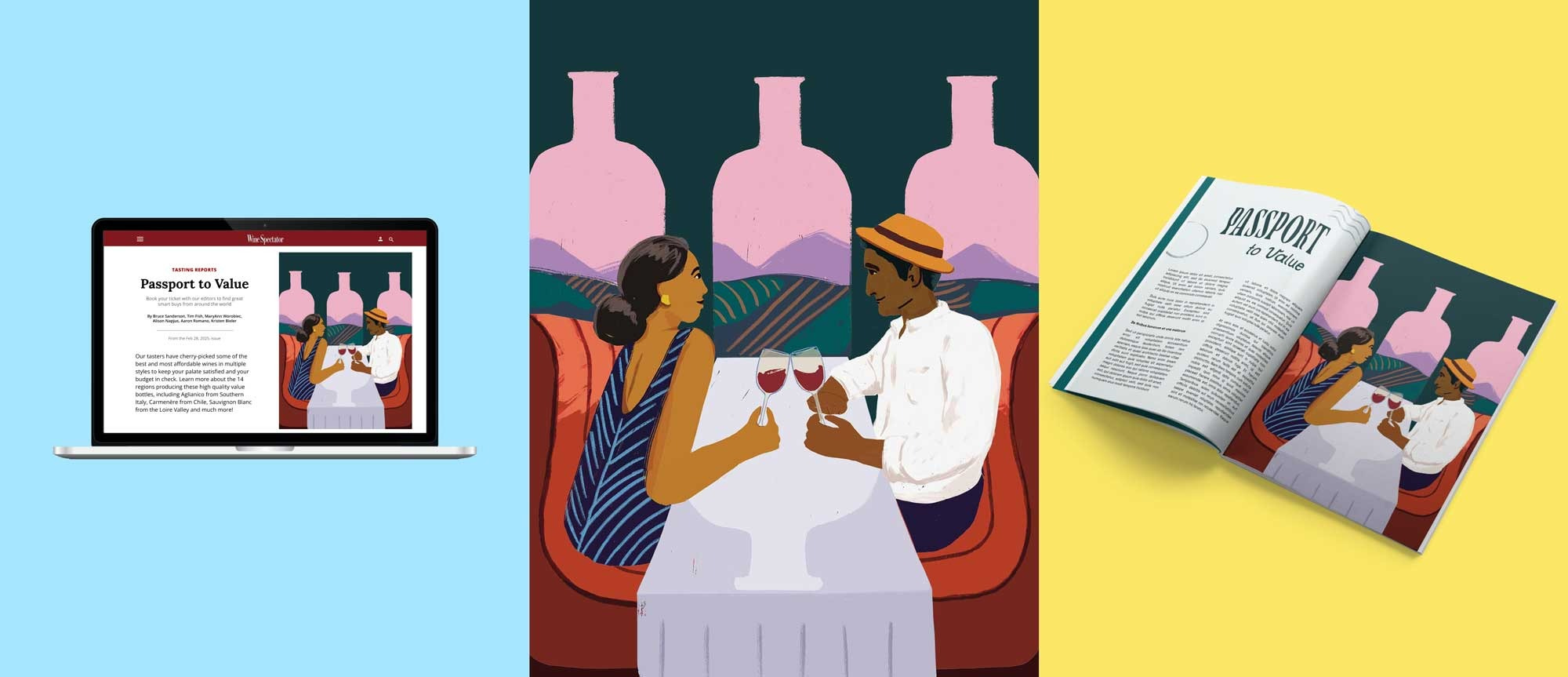
Spec Brief 1: “Passport to Value” for Wine Spectator
Illustrator Molly McCammon provided this brief based on her own previous assignment from Wine Spectator – a full page illustration accompanying an article about discerning luxe wines from places like Chile, Italy, and France, without having to actually shell out the bucks to travel there.
I drew inspiration from vintage travel posters, wine trains, and the ever-alluring first class life.
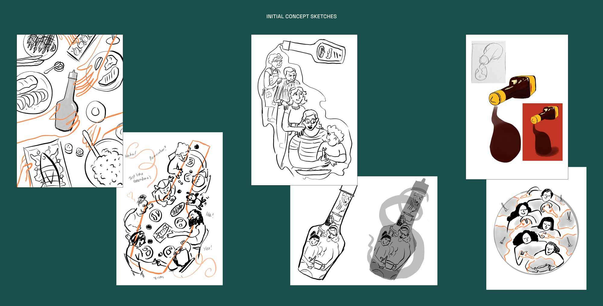
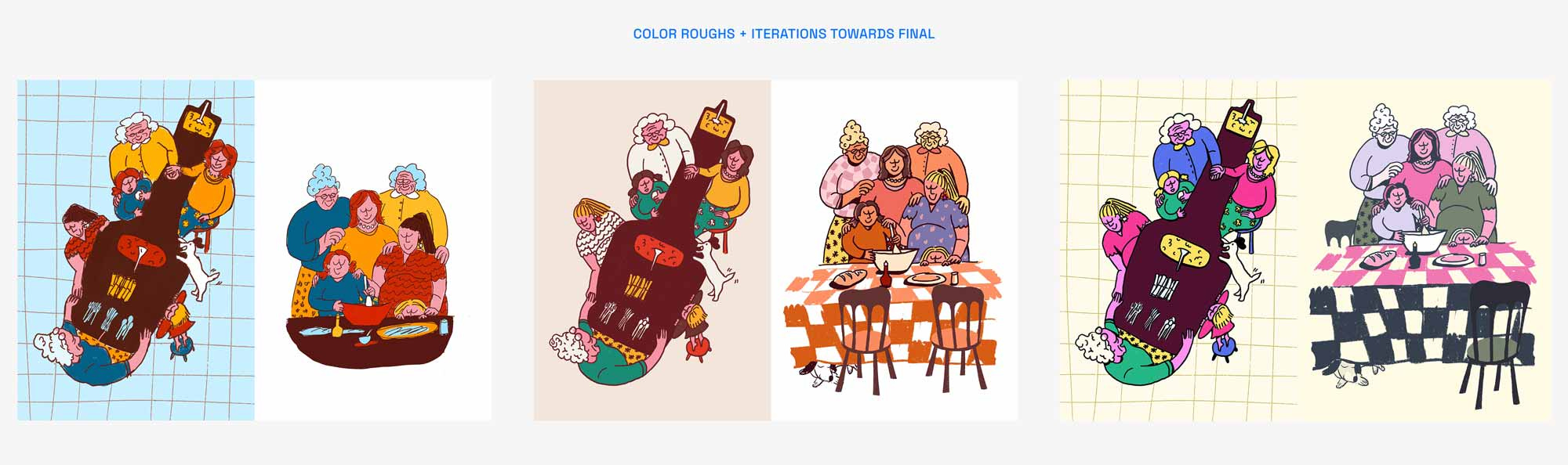
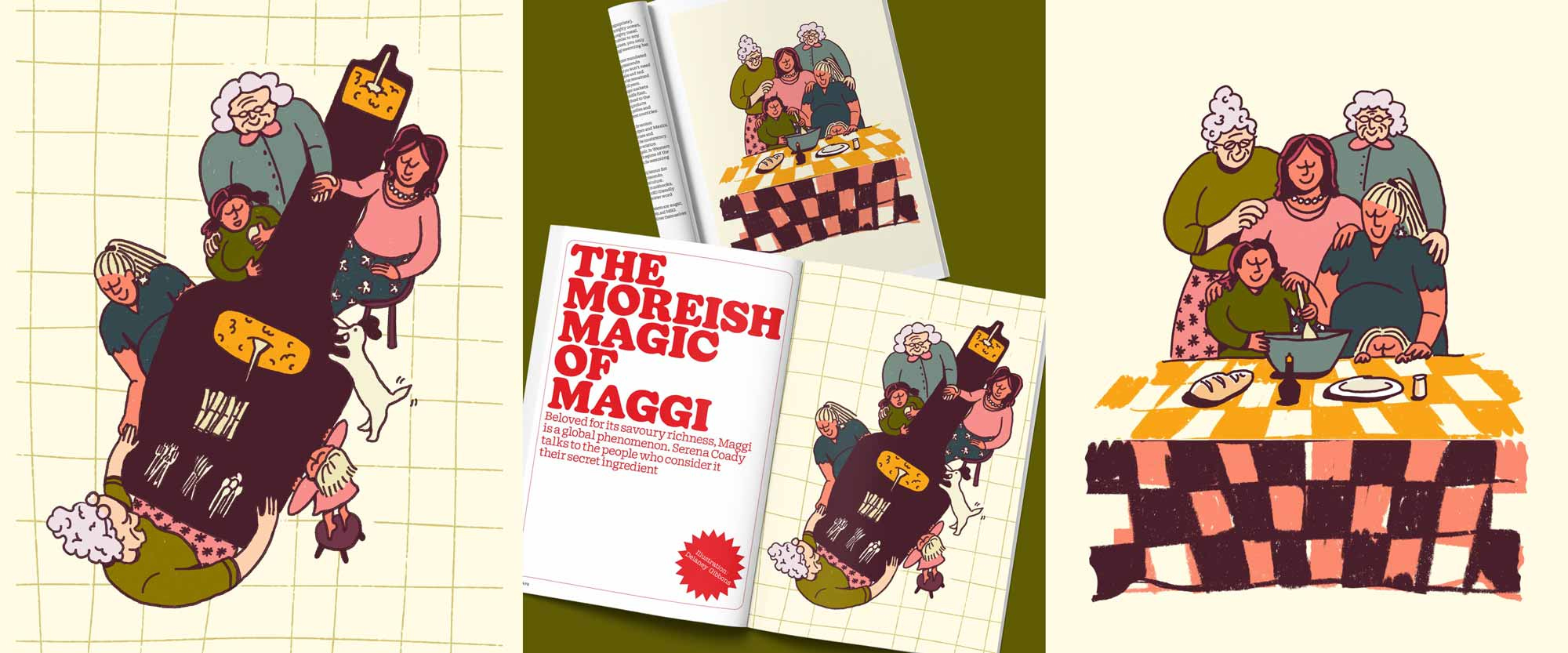
Spec Brief 2: “The Moreish Magic of Maggi” for Pit Mag
Holly Catford, one of the creators of Pit Magazine in the UK, presented an actual brief she’d commissioned for a previous issue. It called for two full page illustrations that celebrated Maggi as an iconic ingredient found in kitchens and pantries across the globe.
I honed in on Maggi’s cross-generational appeal, and the nostalgia associated with happy memories of shared meals.
The Portfolio Boost Challenge
I couldn’t participate in the final round of feedback for the Editorial Playbook because it coincided with our Europe trip, so I was very excited that a 21 day challenge to create a portfolio “hero project” followed not long after.
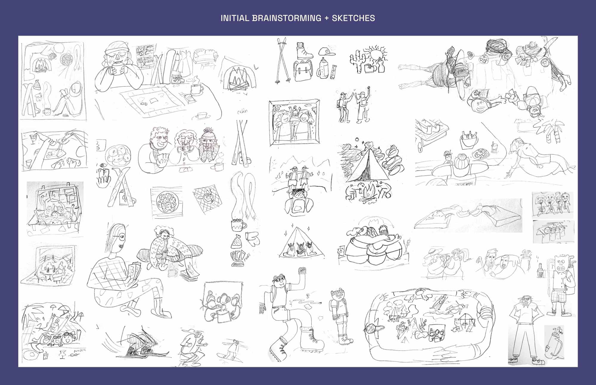
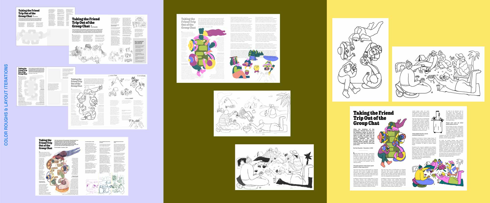
This challenge required that we create our own self-initiated brief for a passion project. I knew from the start that I wanted to set myself a brief to create a double page editorial spread for a magazine or newspaper, that also had commercial potential.
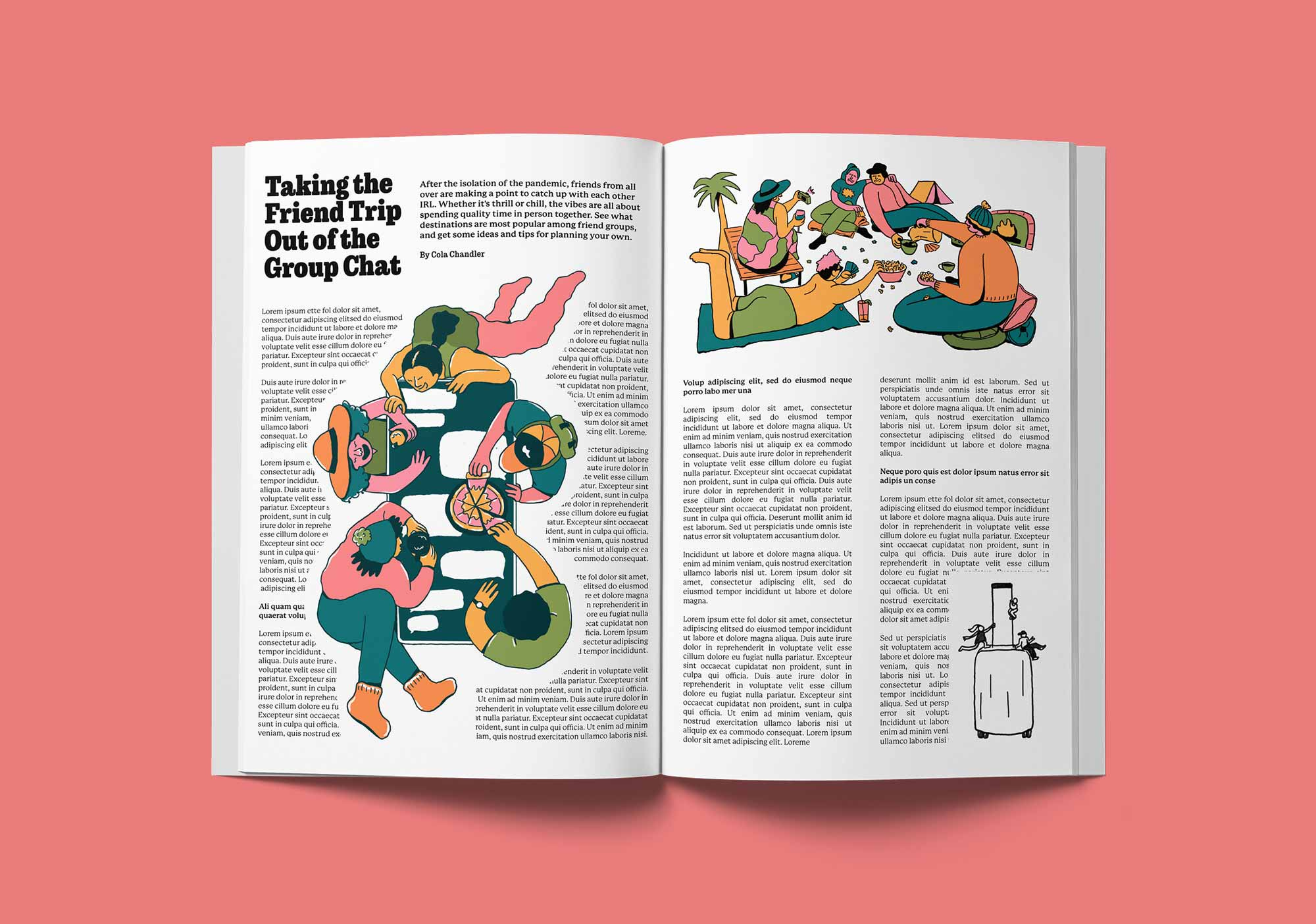
Inspired by years-long convos in my friend group chat in which we try to all get together at the same time in the same place, I came up with the idea of an article titled “Taking the Friend Trip Out of the Group Chat” – something that would lend well to two pages and dynamic illustrations.
To give myself more direction, I came up with an article synopsis:
After the isolation of the pandemic, friends from all over are making a point to catch up with each other IRL. Whether it's thrill or chill, the vibes are all about spending quality time in person together. See what destinations are most popular among friend groups, and get some ideas and tips for planning your own.
Even with the title and synopsis nailed down, there were still so many directions I could go with the artwork, and I didn’t have the benefit of an art director to help reign in ideas or narrow down concepts. It proved to be a good exercise in relying on my instincts and personal taste: what do I want to draw that fits the brief? (Also, what would I want to get hired to make more of?)
I decided the article's key emphasis would be on the joys of spending quality time together, in person. This way, I could draw fun, happy characters in moments of interaction – like shared meals, affectionate touches, laughing and chatting – exactly what I wished my friends and I could do more of! I made sure to incorporate varied characters to reflect a diverse readership, too.
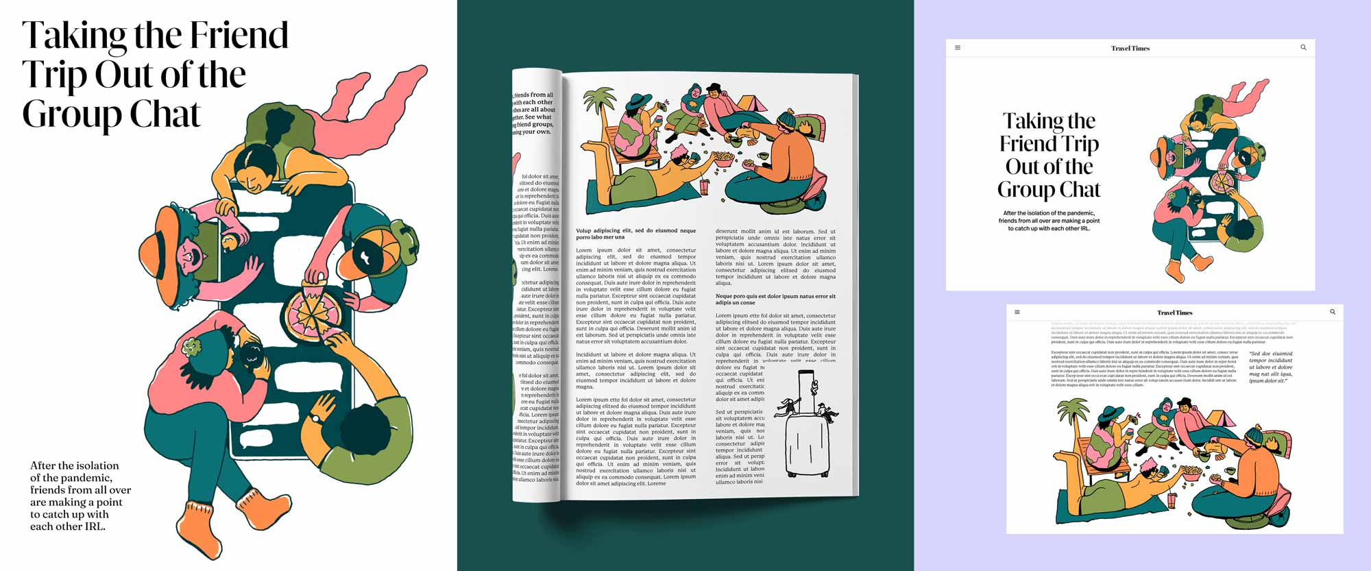
Portfolio Hero Project: Taking the Friend Trip Out of the Group Chat
I approached the rest of the project the way I learned to in the Editorial Playbook challenge: sketches, color roughs, then final – treating it like a real commission, hitting my deadlines, and learning a ton.
Though with this project calling for more deliverables than either of the first two, my sketch and color rounds were a bit more muddied, blending together as I worked out how to design an editorial spread when I am not an editorial designer. (I could run a Skillshare class called Making Things Harder For Yourself 101)
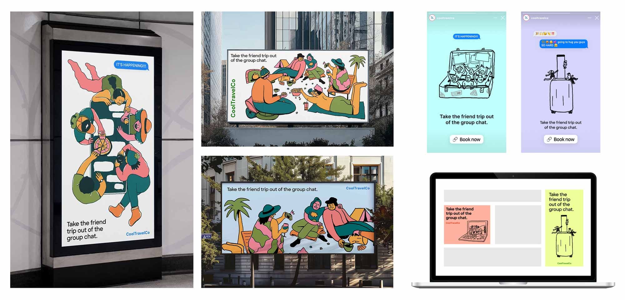
Beyond: Commercial Potential
Commercial viability is certainly a nice-to-have in today’s world. With various marketing and advertising roles in my background, I found adapting the brief to incorporate an ad campaign came relatively easy to me, and was fun to ideate.
Below is an example of how a travel company might utilize the images and sentiment for an ad campaign across media types.
Takeaways
When all is said and done, I think my biggest takeaway from these challenges is the importance of silencing that perfectionist voice.
If I kept tweaking the images as much as I wanted to, or felt like I needed to, I would literally never start working on something new.
If you learn by doing, it’s likely that your sensibility for the subject could eventually outpace the limits of the project you’re learning it on. And our ever-insecure brains want to prove how much we know the material. So that voice starts to chime in – but that voice isn’t trying to make me better. It’s trying to protect me against possible failure. It’s the brain kind of saying, “Well, if it’s never finished, no one can ever judge it, or react negatively to it.”
I literally had to make myself stop and say “Ok, I’m declaring this finished. I’ll take what I’ve learned with me to the next one.”
Otherwise, I would never have work samples to send to Art Directors in order to get jobs (which is the next step! which is the scariest part!! I am acutely aware!!).
Tomorrow is the start of Make Your Mark Bootcamp, a 9 month cohort hosted by Inkygoodness, and their main course offering. It’ll keep me busy, which will keep me from spiraling about all the awful in the world.
I’ll sign off with my favorite Irish proverb: “Under the shelter of each other, people survive.”
‘I drew inspiration from vintage travel posters, wine trains, and the ever-alluring first class life’ you write, so I am assuming the mock-up origination and artwork is yours? It is so full of colour and space.
I love it and had I the money I would give you a commission to give the cover and layout of my paperbagstory booklets, of which I print 3-5 of each only for the cafe I write/begin my short stories in, a makeover. They are A5 page size (21cm h x 14.85cm w), but I will, with your permission take inspiration from you and acknowledge you on the inside back cover. A fascinating post I enjoyed reading.🐰
I love seeing your process! So many good sketches that I couldn’t guess which one you went with for the final but was delighted with each one! My favorite has to be the family around the maggi bottle :)